The NBA and Nike unveiled the 2021–22 NBA City Edition uniforms. We ranked them from worst to best.
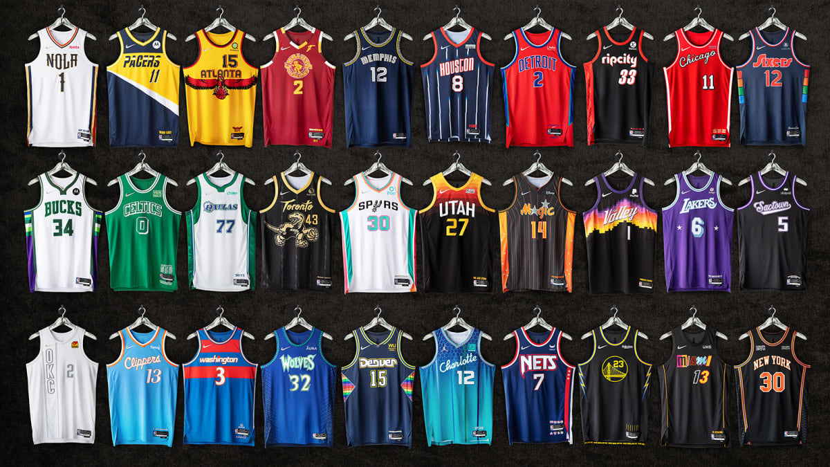
A new season means that Nike cooked up another round of City Edition uniforms for each team. This year’s uniforms focused on the NBA’s 75th anniversary while paying tribute to each team’s most iconic moments. The Crossover ranked them all.
Courtesy of Nike
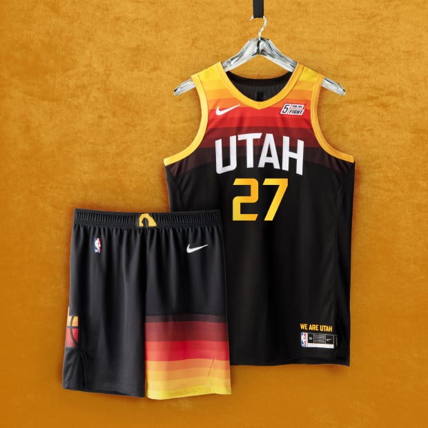
INC. Utah Jazz
The Jazz are running back last year’s City Edition uniforms. Not a bad uni at all but wish they had some fun with the uniforms from the Pistol Pete era.
Courtesy of Nike
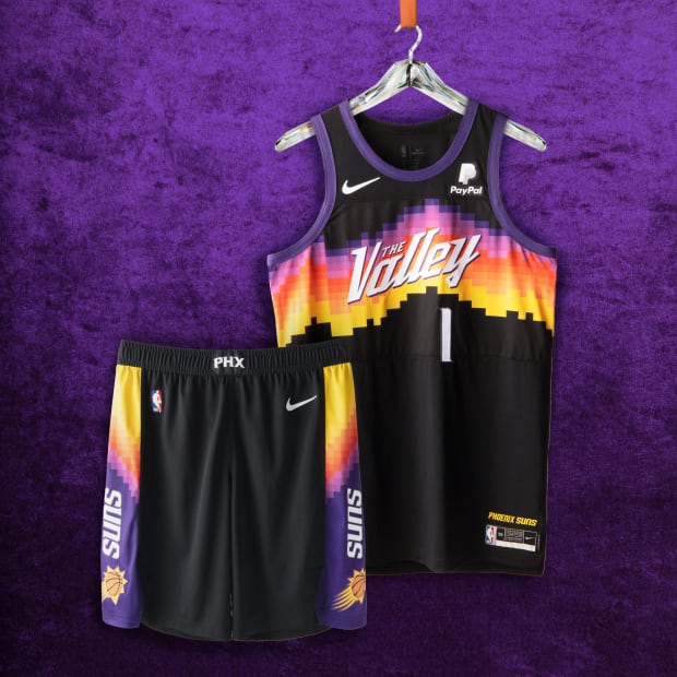
INC. Phoenix Suns
The Suns are running back last year’s Valley uniforms. They went to the Finals last season in these, so I understand.
Courtesy of Nike
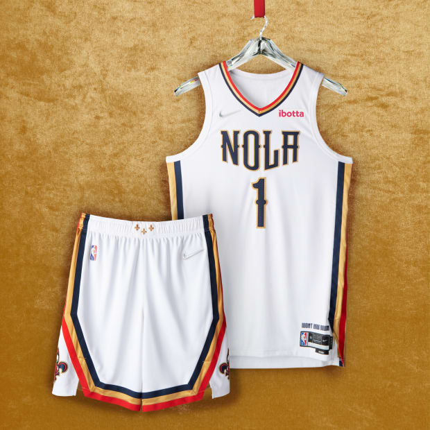
28. New Orleans Pelicans
Nike’s inspiration: The uniform boasts red, gold and navy stripes, as well as the signature “NOLA” emblem, iconic fleurs-de-lis on the belt buckle in Mardi Gras gold, and an anthem that defines this team as much as it defines the city it calls home: “Won’t Bow Down.”
SI’s review: Uniforms are not that much different from their current ones.
Courtesy of Nike
27. Oklahoma City Thunder
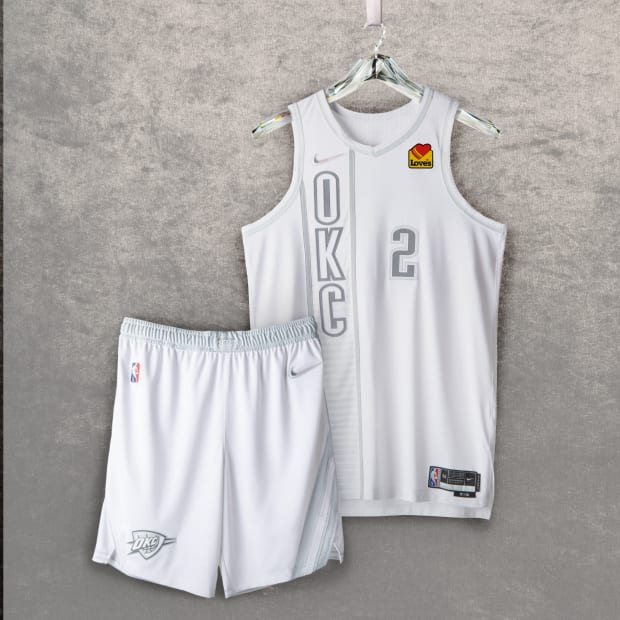
Nike’s inspiration: Atop a white base, which represents a team that’s still writing its history, these jerseys bring back the vertical lettering from the Thunder’s first alternative uniform, worn from 2012 to ’16. Additionally, there is a sash detail on the shorts from the ’18 City Edition uniform, which honors Oklahoma’s Native American culture, as well as a foundational, core brand element from the ’18 Home uniform.
SI’s review: Thunder are in full rebuild mode but they should have fun with colors when they have one of the best dressed players in SGA. All-white? Nah.
Courtesy of Nike
26. Orlando Magic
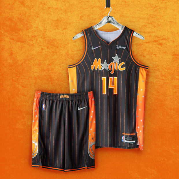
Nike’s inspiration: These uniforms honor that past, blending elements from a selection of uniforms linked to team lore. This includes the orange (and anthracite) detailing celebrating the orange groves that helped build the city’s economy, as well as the iconic comet ball on the side panel that represents a team that’s chasing higher heights.
SI’s review: I know a lot of people like these, but I will never be a fan of grey on uniforms.
Courtesy of Nike
25. Milwaukee Bucks
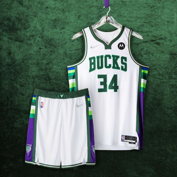
Nike’s inspiration: The uniform features striping from the early days of the franchise in the ‘70s and ‘80s, updated to include Great Lakes Blue from their current uniform sets and purple from the late 90s/early 00s.
SI’s review: Would have loved to see a play on the purple deer uniforms Ray Allen used to wear.
Courtesy of Nike
24. Miami Heat
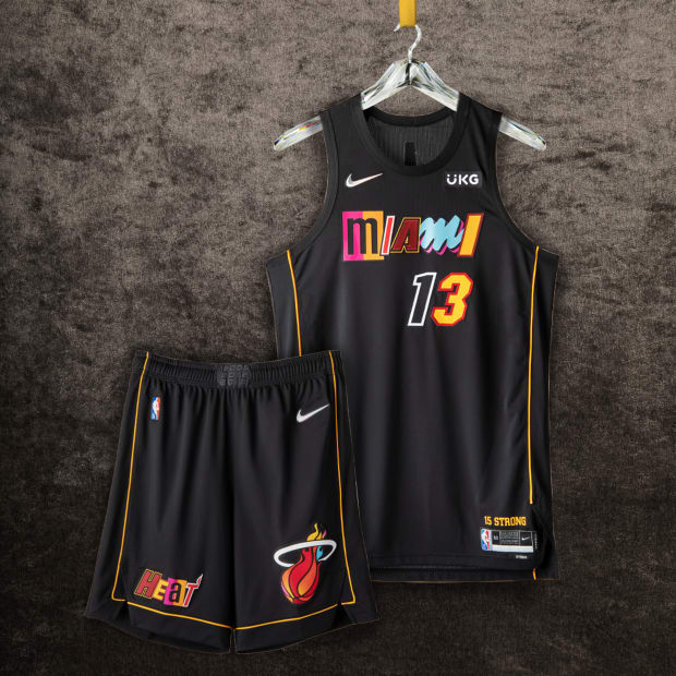
Nike’s inspiration: Miami Mashup is the first uniform in professional sports history to feature individualized number styles. This uniform is a mixtape in the truest sense of the word: A signature collage of letters and numbers from eight of the franchise’s most iconic uniforms, all woven together. It’s a look that celebrates a team that’s always been as vibrant as the city where it plays. A black base color provides a neutral foundation for its mashup-style “MIAMI” wordmark, which features assorted letter forms pulled from popular HEAT uniform sets, including Miami Floridians, Hardwood Classics, and VICE Nights, among others.
SI’s review: I understand the messaging of mashing up everything, but the Heat had a good thing going with the original Vice City edition uniforms. They should have just kept them going.
Courtesy of Nike
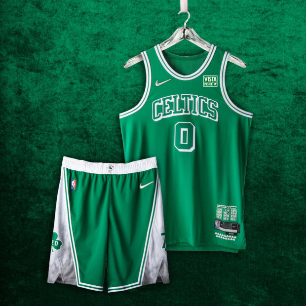
23. Boston Celtics
Nike’s inspiration: The Celtics uniform honors a team whose history includes some of the greatest players and greatest rivalries in sports, as well as one of the greatest to ever coach the game. The foundation of this uniform is based on the 1946 and 1949 Celtics teams. The uniforms stay true to the Celtics’ classic style but look closer and you’ll see that Lucky returns to his look from the unmatched title run of the 1960s, along with the arm and neck stripes.
SI’s review: I get it! The Celtics have a classic uniform. But these are a bit boring.
Courtesy of Nike
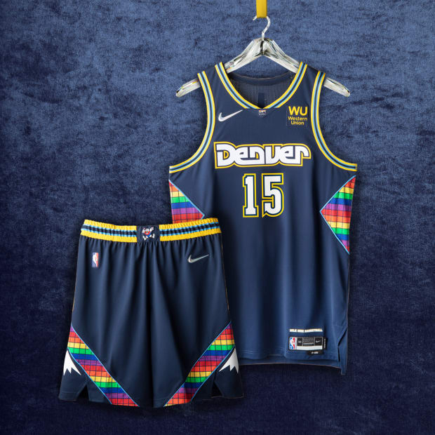
22. Denver Nuggets
Nike’s inspiration: In the ABA’s final season in 1976, the Nuggets were the team to beat. In the ‘80s, their fast-breaking style broke scoring records and set fans afire. In the ‘90s, they finger-wagged their way to what was the biggest playoff upset in league history. Uniform details from each of those moments are included in this year’s City Edition. The iconic rainbow tetris pattern returns on the sides, shorts and neckline.
SI’s review: This feels a bit forced. Bring back the Melo era uniforms!
Courtesy of Nike
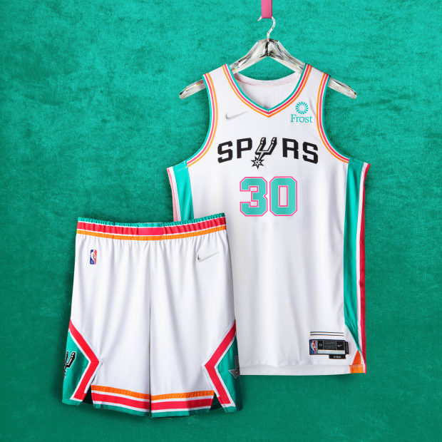
21. San Antonio Spurs
Nike’s inspiration: Lining the entire uniform are the signature fiesta stripes, which first appeared on the team’s warmups in the mid-90s.
SI’s review: Last year’s uniforms were close to perfect. Should have kept them.
Courtesy of Nike
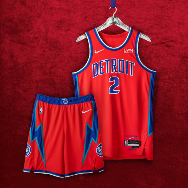
20. Detroit Pistons
Nike’s inspiration: Featuring select colors from the past and present, honors the franchise responsible for the baddest basketball ever played.
SI’s review: Bring back the Teal!
Courtesy of Nike
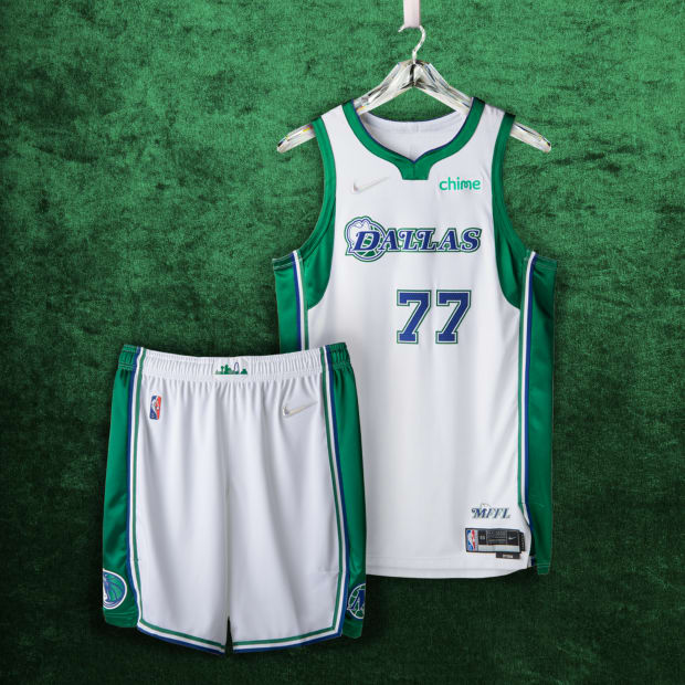
19. Dallas Mavericks
Nike’s inspiration: Although the Nike NBA City Edition uniforms return to the Mavericks’ roots, paying tribute to the green accents and Western typography of the team’s early years, with a silhouette of Texas and 1980, the year the Mavs settled there, this is the first time a cowboy hat has been worn by the “D” on the Dallas wordmark.
SI’s review: Love the throwback color scheme but it feels like something is missing.
Courtesy of Nike
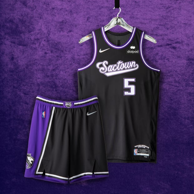
18. Sacramento Kings
Nike’s inspiration: The uniform’s black base represents the strong will and determination of the city, while also transporting fans back to the no-look circus passes, behind-the-back dribbles, unrivaled ball movement and thunder dunks from the Greatest Show on Court in the early 2000s.
SI’s review: The uniform pays homage to one of the most exciting teams ever. I am not mad at it but wish there was a little bit more.
Courtesy of Nike
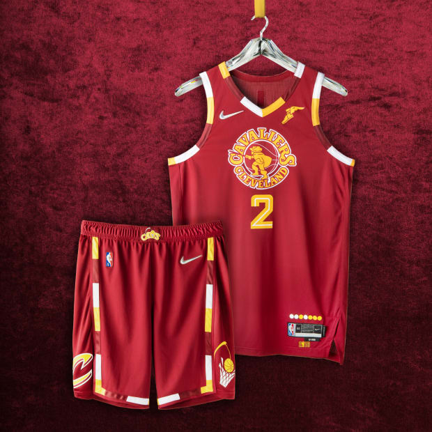
17. Cleveland Cavaliers
Nike’s inspiration: The uniforms are painted in the classic crimson and gold and mark the return of the team’s first swashbuckling Swordsman from the 1970s and the Miracle at Richfield. The jersey pays tribute to the 2016 championship season, and the legendary comeback that brought the city its first title in generations.
SI’s review: Not bad but feels a bit plain.
Courtesy of Nike
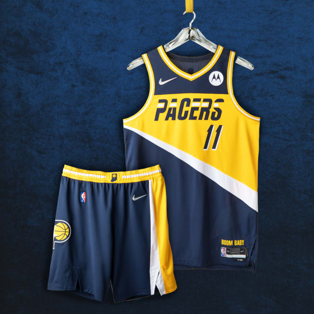
16. Indiana Pacers
Nike’s inspiration: It pays homage to the team’s unique history, a story that spans from its three ABA championships in the early 1970s, to its 2000 Eastern Conference Championship, to the present.
SI’s review: The Flo-jo uniforms are always a win.
Courtesy of Nike
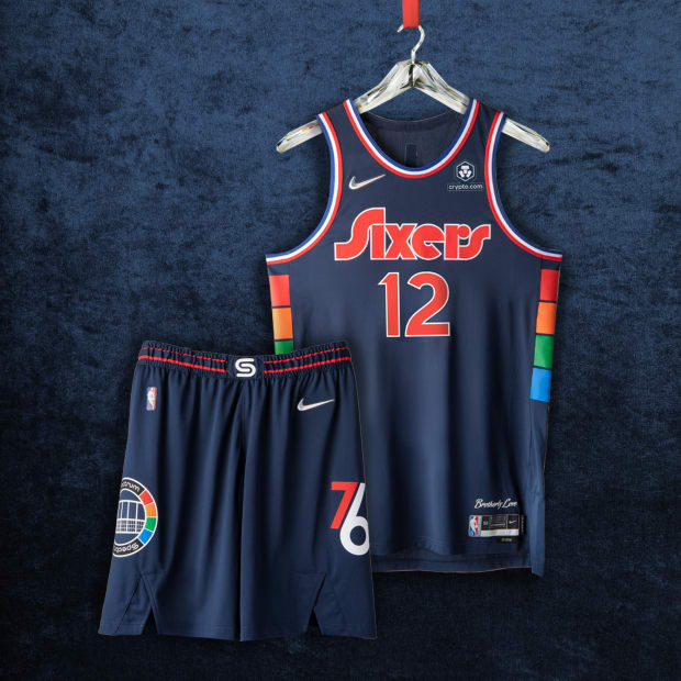
15. Philadelphia 76ers
Nike’s inspiration: For more than four decades, the Philadelphia Spectrum Arena was a playground for Hall of Famers, MVPs and the “fo’ fo’ fo’” 1983 NBA champs. The Arena’s signature multicolor pattern runs up the sides of the uniform.The deep blue body color is a deeper version of the iconic 76ers royal, while the wordmark, numbers, and player names are inspired by the Sixers aesthetic from the late ‘70s, while the anthem honors the city’s longtime nickname.
SI’s review: I wonder if Ben Simmons will ever wear these?
Courtesy of Nike
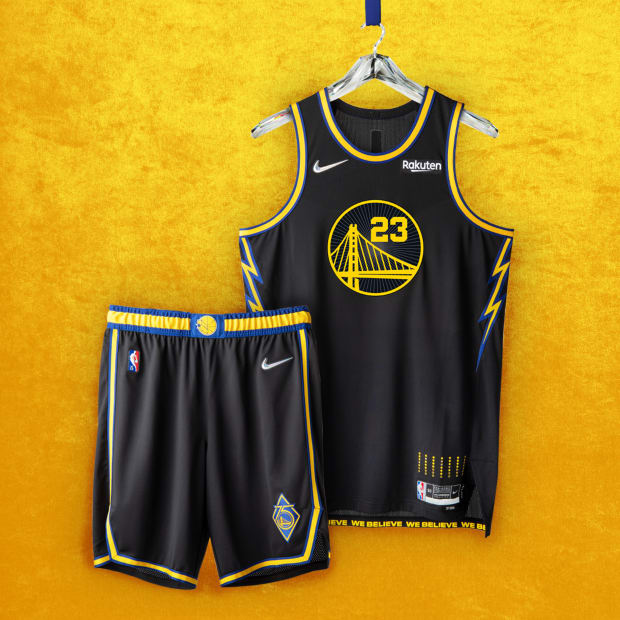
14. Golden State Warriors
Nike’s inspiration: Uniform honors the team’s home city, community, and culture with unique colors and designs. This uniform’s inspiration started with Oakland, Dub Nation’s home for nearly five decades. The black base references the team’s famous “Town” jerseys. The “Bay Bridge” logo is surrounded by a design representing the roof of the team’s old home, Oracle Arena. As a tribute to the Warriors of the late 2000s, lightning bolts line the uniform’s side panels. The shorts are designed with a golden trim, and feature two logos—one marking the Warriors’ 75th anniversary and the other celebrating the “We Believe” team that put basketball back on the map in the Bay.
SI’s review: These are not necessarily bad but I expected more.
Courtesy of Nike
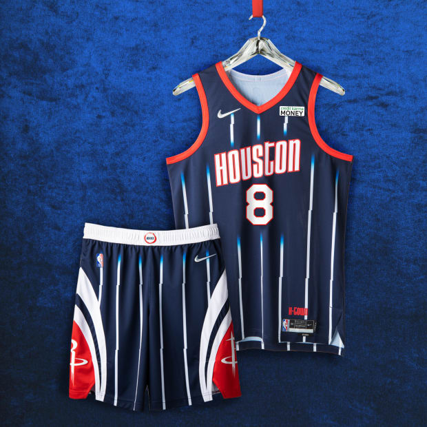
13. Houston Rockets
Nike’s inspiration: The uniform’s style is inspired by the mid-90s uniforms, with white pinstripes fading into navy that continue to the shorts.
SI’s review: Only right to bring the Steve Francis jerseys back while having another super athletic talent like Jalen Green.
Courtesy of Nike
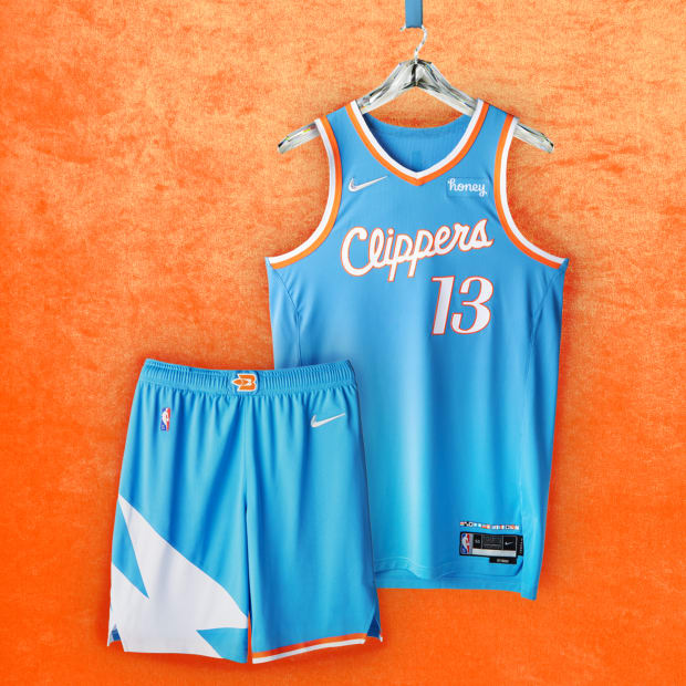
12. Los Angeles Clippers
Nike’s inspiration: The uniform has a pacific blue base color, a choice inspired by retro looks from the team’s past incarnations as the Buffalo Braves and San Diego Clippers.
SI’s review: These are really clean. Have no complaints.
Courtesy of Nike
11. Washington Wizards
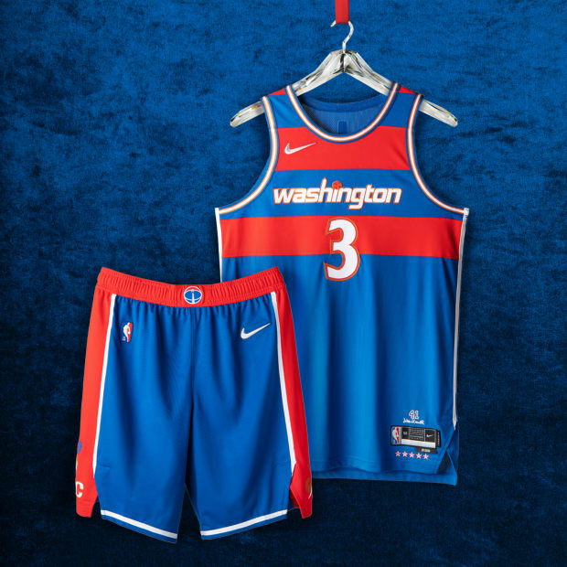
Nike’s inspiration: Wes Unseld helped define the franchise’s days in Baltimore, its move to Washington, and its 1978 championship season. The red stripes atop a blue base pay homage to the classic Bullets uniforms from the ‘60s and ‘70s, and Unseld’s iconic 1968 season—when he earned both the league’s MVP and Rookie of the Year honors. The royal blue base color and jersey number set are an ode to the teams of the 2000s, and gold makes its return to the uniform set, trimming the edges of the jersey numbers. The “Washington” wordmark across the jersey’s chest is a remixed take on the look that highlighted the team’s memorable “Stars & Stripes” run in 2016-17.
SI’s review: Simple and clean.
Courtesy of Nike
10. Memphis Grizzlies
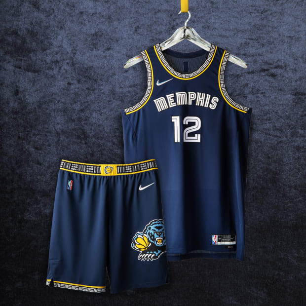
Nike’s inspiration: The uniform remixes styles from past and present. Its main colors are the Midnight Blue and Grizzlies Gold, that have defined Grizzlies style since 2004 and its asymmetry continues to represent the city’s geography, anchoring the state on one side along with the unique and unconventional history of Memphis and the Grizzlies.
SI’s review: Memphis ranked No. 1 in last year’s rankings and these are not a bad follow up.
Courtesy of Nike
9. Charlotte Hornets
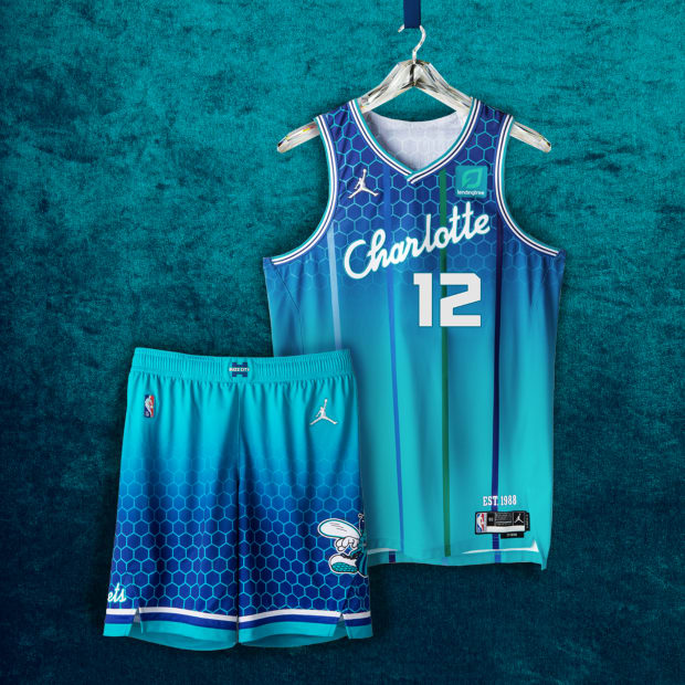
Nike’s inspiration: The legendary teal is front and center, covered with a subtle honeycomb pattern to let opposing teams know they’re in the hornets’ nest. The uniform includes the familiar multicolored pinstripes from the original Hornets uniforms worn from 1988-1997, along with a vertically gradated cell pattern that pays tribute to the court design from the Charlotte Coliseum.
SI’s review: The Hornets’ 1990s uniform is one of the best jerseys ever. I am just not that big of a fan of the honeycomb. But these are really good!
Courtesy of Nike
8. Los Angeles Lakers
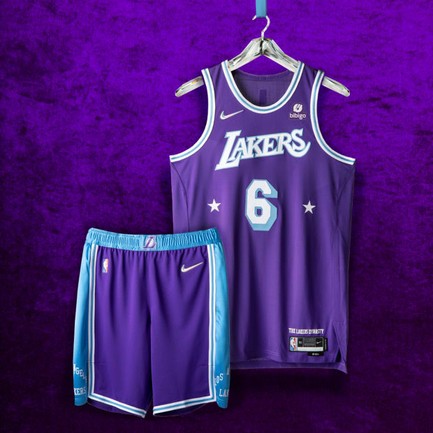
Nike’s inspiration: The 2021–22 Los Angeles Lakers Nike NBA City Edition Uniform is a culmination of the Lakers’ essence—17 championships built atop power post-ups and no-look fast breaks; sky hooks, baby hooks, and thunderous alley-oops. From head to toe, the primary color is the iconic Laker purple that emerged in the late 1960s. The stars surrounding the uniform number evoke the groundbreaking Minneapolis Lakers of the early 1950s.
SI’s review: There is a lot of pressure each year for the Lakers’ unis. Don’t want to stray too far from the classic looks but they did a great job with these unis.
Courtesy of Nike
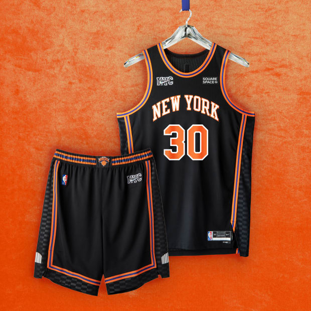
7. New York Knicks
Nike’s inspiration: The black uniforms, with orange and blue piping and checkered side panels, are fit for a city that never sleeps.
SI’s review: The Knicks always play better when they have black on their uniforms.
Courtesy of Nike
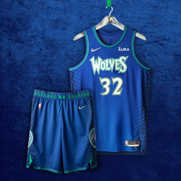
6. Minnesota Timberwolves
Nike’s inspiration: Blending together elements from a selection of looks forever linked to three eras that play a big role in team lore: The Expansion, The Big Ticket and The Now. The blue, green and white color palette of the jerseys returns from their high-flying inaugural 1989 season. The legendary wordmark font and beloved tree trim imagery that defined their gritty, “Big Ticket” teams in the early 2000s have been brought back as well. The wolf logo on the shorts signifies the origin of the team.
SI’s review: The Timberwolves got it right this year with this color scheme. Not that big of a fan of the black stripes. I miss the Prince uniforms but these are really, really good.
Courtesy of Nike
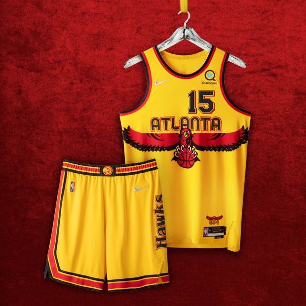
5. Atlanta Hawks
Nike’s inspiration: Uniform honors a Hawks heritage of flamboyant style, epic duels, impossible dunks and infinite highlight reels—setting the tone for a young dynamic team to carry the mantle of the greats who built the franchise. The legacy yellow jerseys with torch red elements and throwback typography symbolize the Atlanta Hawks’ red-hot spirit and fiery passion for the game. The front numbers pay tribute to the first uniforms that debuted in 1968 while the back numbers harken back to the 80’s era.
SI’s review: Will miss Peachtree but the Hawks rebrand over the years has been one the best.
Courtesy of Nike
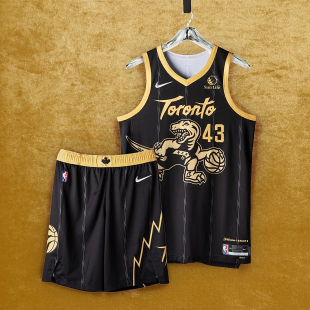
4. Toronto Raptors
Nike’s inspiration: The popular black base and gold trim return, with the iconic dino logo, scrawled across the chest. But this time, the signature raptor’s style is remixed, donning the look from the 2019 title-winners and flipping the Raptor’s direction from the Nike NBA Hardwood Classic uniform – the Raptor is looking back at our team’s history, rather than forward, grounding it back in the larger anniversary. The jagged pinstriping and short design echo the team’s inaugural uniforms from a quarter-century ago. Today’s claw-scratch logo appears on the shorts, with a Canadian maple leaf on the waistband reminding fans of the team’s roots.
SI’s review: The OVO uniforms are always going to be a big win. The Raptor looking back at its past is a great touch.
Courtesy of Nike
3. Portland Trail Blazers
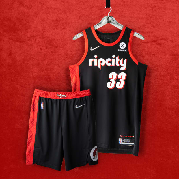
Nike’s inspiration: Since 1970, the franchise has been a part of the Pacific Northwest’s character, and these uniforms call back to so many of the highest highs in franchise history. The 1977 NBA Championship. A pair of Finals appearances in the early ‘90s. An overtime buzzer beater and a series-clinching game-winner in the new millennium. A signature plaid pattern honors an all-time coach. A “City of Roses” anthem nods to the city that has always supported its team.“Rip City” appears in the retro ‘90s style font with a drop shadow.
SI’s review: Didn’t try to do too much and it paid off. Just beautiful.
Courtesy of Nike
2. Chicago Bulls
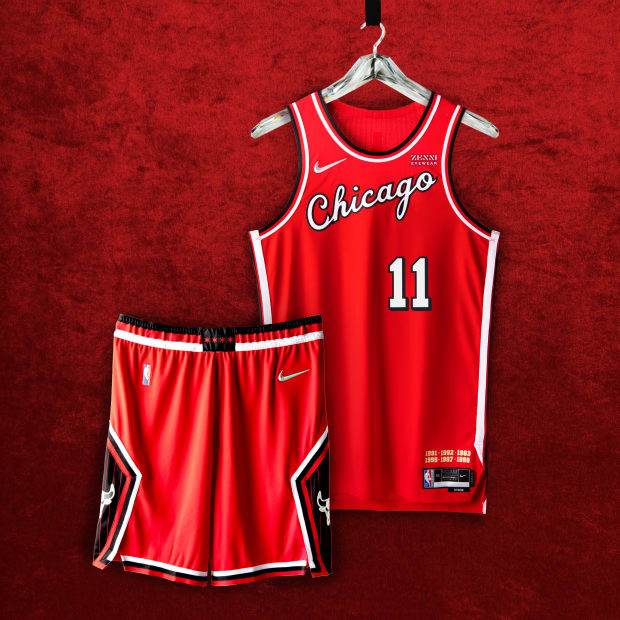
Nike’s inspiration: You don’t mess with a classic. So how do you make the most of one of the least-changed uniforms in NBA history? You nod to the franchise’s first season in ‘66, and bring back the iconic typography from the ‘84 rookie season when the greatest to ever play the game entered our lives. And you pay tribute to the three-peats—both of ‘em.
SI’s review: The Bulls are always going to have one of the best uniforms. The color scheme is a cheat code. These are beautiful.
Courtesy of Nike
1. Brooklyn Nets
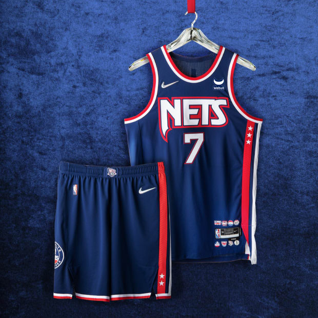
Nike’s inspiration: Brooklyn Nets uniform honors the franchise’s legacy from New York to New Jersey and back, paying tribute to a sequence of iconic looks from the iconic logos, stars and stripes of the seventies to the futuristic imagery of the back-to-back trips to the NBA Finals.
SI’s review: These uniforms are just too clean. Here’s to hoping the Nets bring back the blue, red and white color scheme for good.
More NBA Coverage:
• Roundtable: NBA’s Early Surprises and Disappointments
• 10 Early NBA Season Trends to Watch
• Knicks Rising in the East With New-Look Offense
• How Chicago Became the NBA’s Most Intriguing Team


